The problem:
The client, a political consultant, came to me wanting an online tutorial.
For years, she had been giving live trainings about a software widely used in her field. She wanted a way to make these trainings less time-consuming for her, and more useful to the learners. This was complicated by the fact that her learners are numerous, but sporadic; some would only use the software for an hour or two, while others would be using it for months.
I identified three main problems to solve:
- Learners can’t really get familiarized with the app without seriously altering essential data.
- Learners don’t always know how to enter the data correctly.
- Learners who get this training have a wide gap in age and technological literacy.
The solution:
I realized the ideal format would be a mix of different approaches:
- A quick video tutorial to give the learner an overview of the app and what is expected of them.
- A mock-up, allowing them to play with the app and learn through experience, without fear of breaking something or deleting important data.
- Mini scenarios to have them practice their decision-making skills when entering data in the app.
Recreating the app:
To recreate the app prototype, I used screenshots of the real app and wireframed them in Figma. After the client’s review and approval, I started to build the project in Storyline.
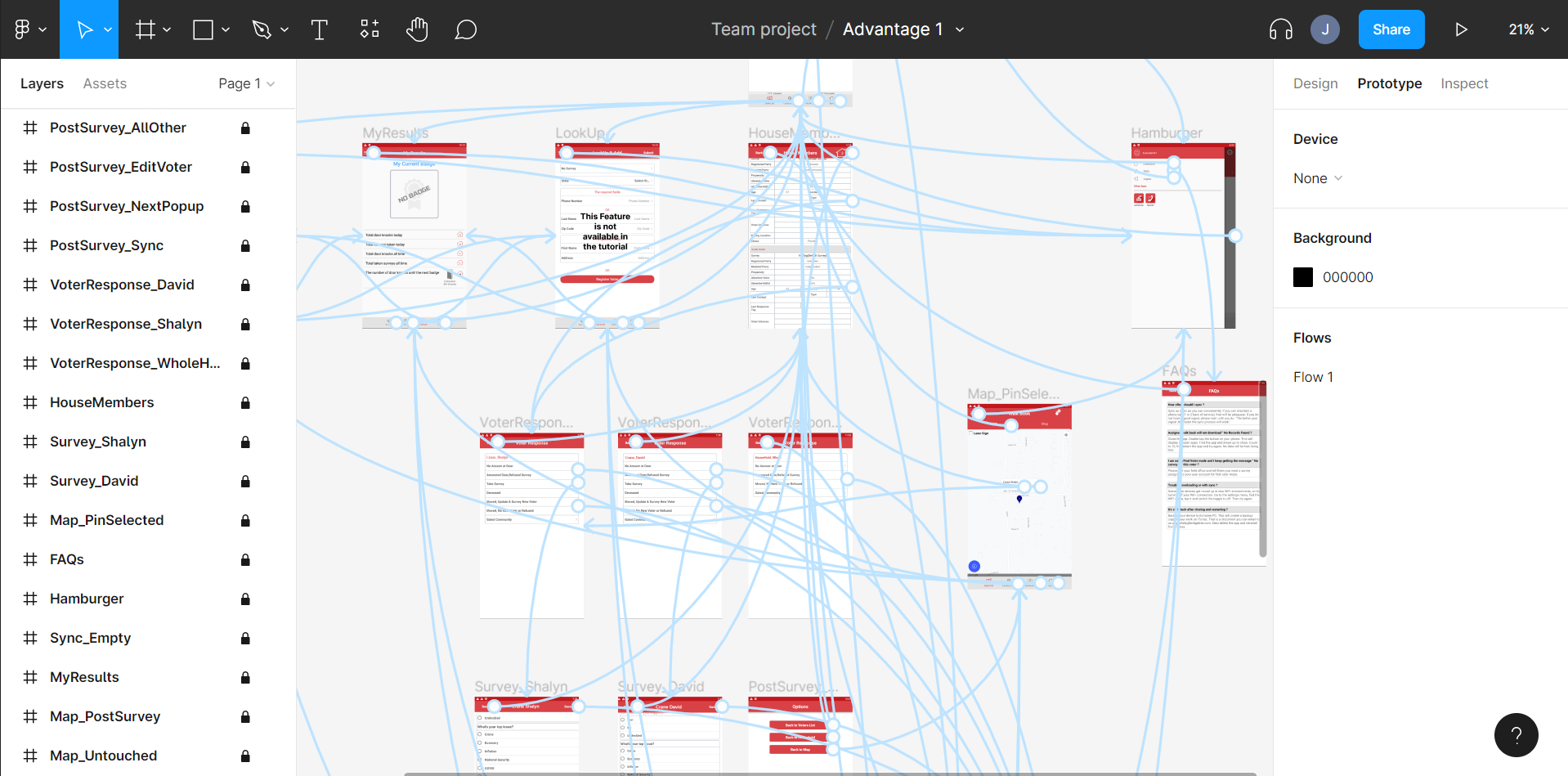
Here is what the recreation of the app looks like:
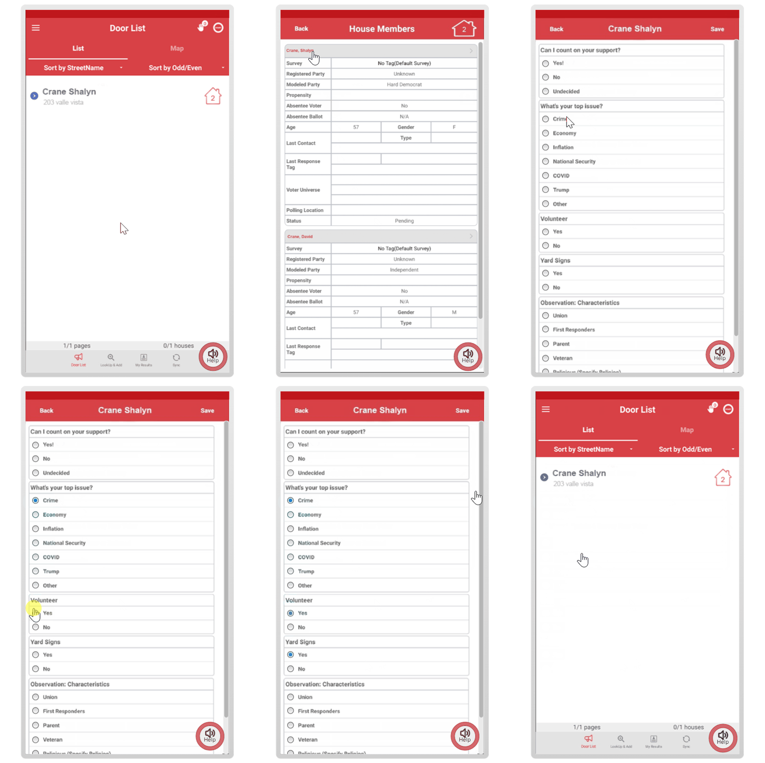
It looks almost identical to the real app, except I’ve added a help button. The client recorded an audio file for each page. I did some audio editing, removed background noise, and added captions.
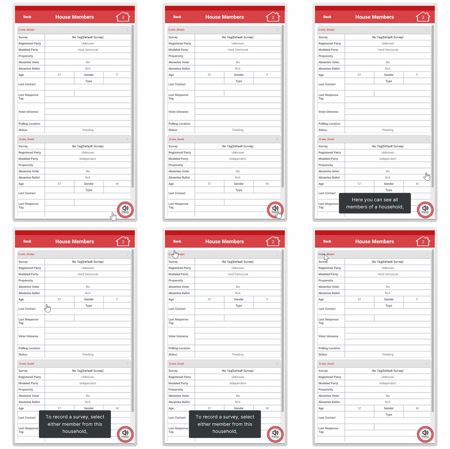
The video tutorial was recorded using OBS. It needed to be as short as possible to be watchable in the field, while walking doors. I then edited it in Camtasia and added captions in Storyline.
The practice activities - a door knocking simulation:
The visuals were designed in Figma.
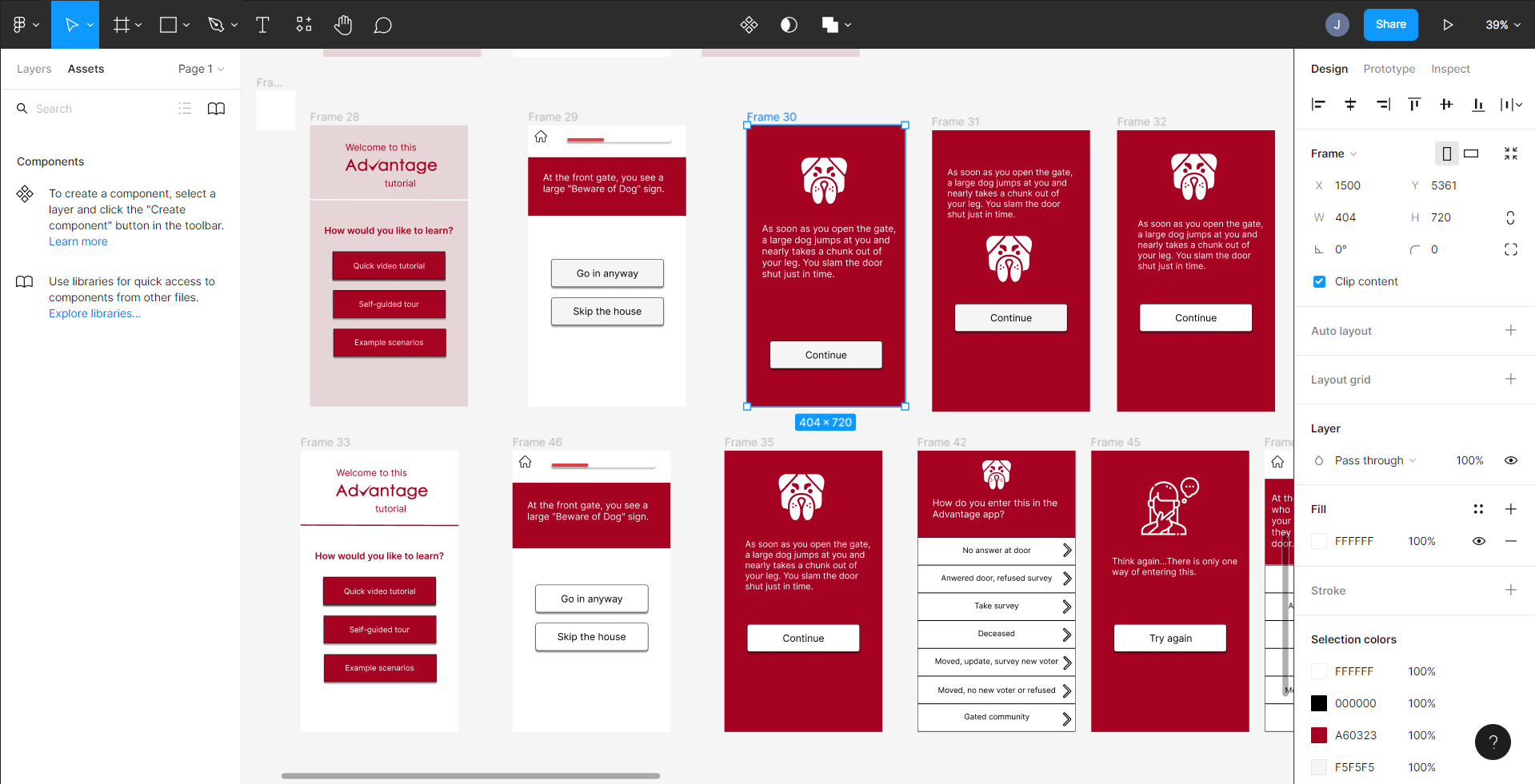
I wrote content following these principles:
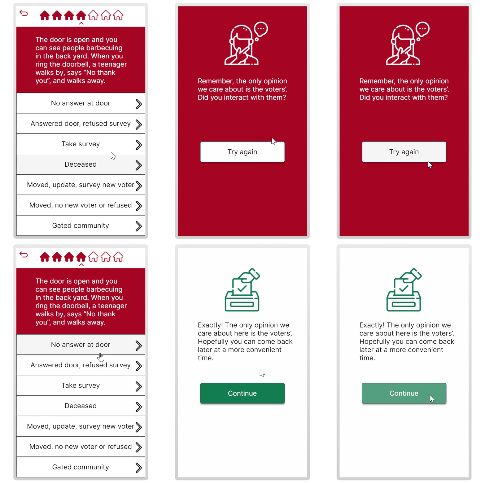
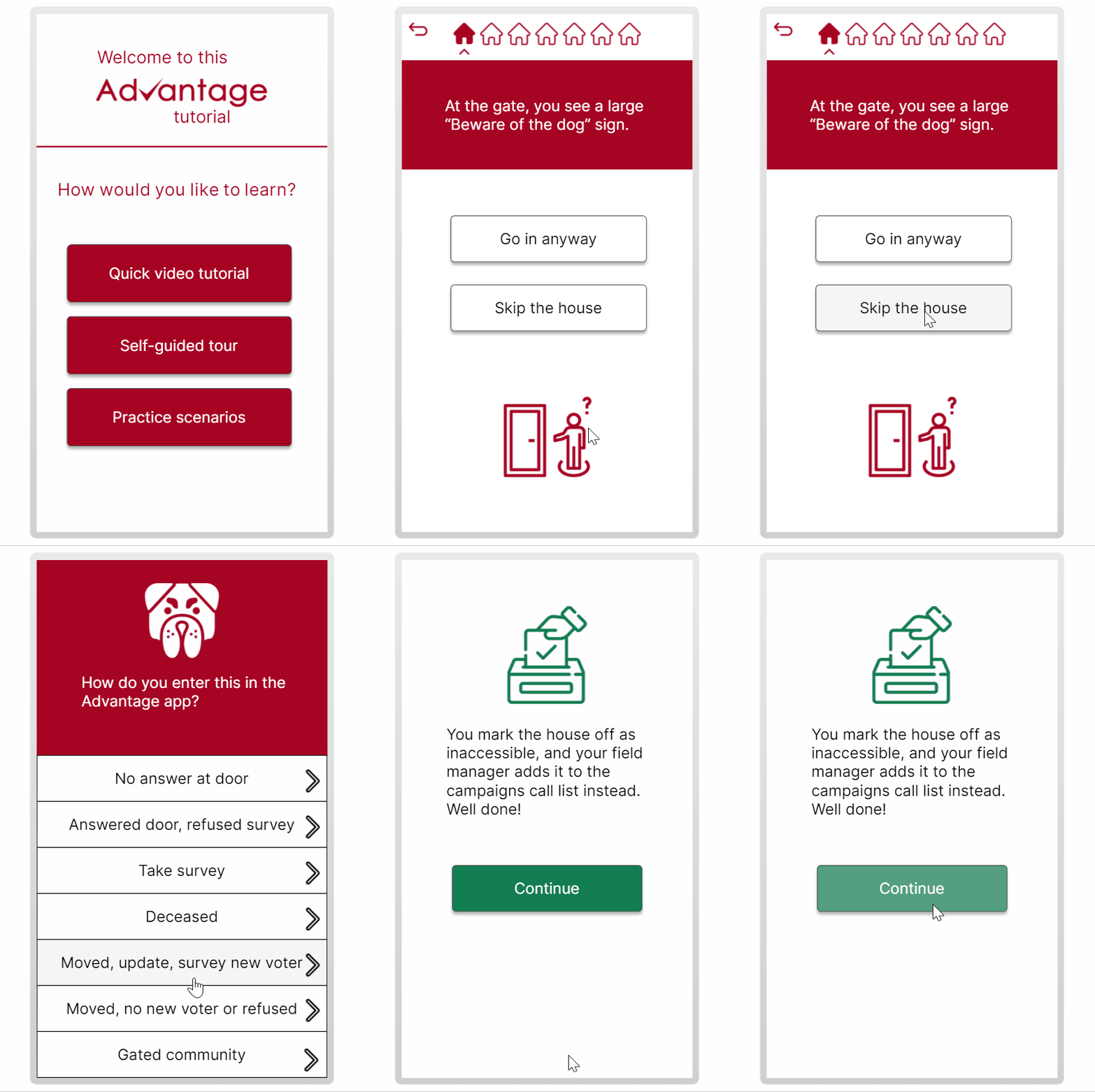
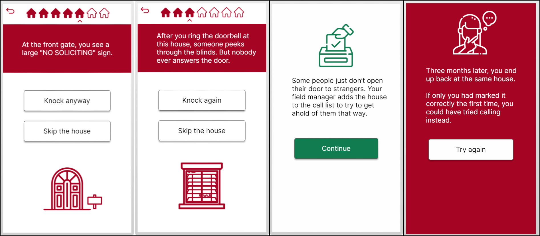
The activity asks people to make real-world decisions. They should be challenging enough to have the learner pause and think to interpret what’s going on, and how to respond. Learning requires friction.
I’ve included aspects of the situation that make the decision hard. By adding realistic details about the context, it opened up many possibilities for options which makes the decision harder.
Only real-life examples are used. When facing a new problem, people dig through prior knowledge and evaluate whether it applies. This is why it’s so important to give learners an opportunity to build those memories for later use.
The feedback shows the realistic consequence of the learner’s decision and lets the learner draw conclusions. It requires them to think.
Gathering learner's data without an LMS:
I captured location data, right and wrong answers, and other user statistics thanks to an eLearning widget.
It allowed me to get all the data I needed directly into my clients’ Google Sheets without needing an LMS or requiring the use of xAPI.
I wrote a tutorial about it in my blog section:
